
Suzuki modernizes iconic “S” emblem for first time in 22 years
Suzuki Motor Corporation has unveiled its first redesign of the classic “S” emblem in 22 years, marking the start of a new visual identity that will extend across all of Suzuki’s products — including its motorcycles, ATVs, and marine engines. The updated logo will make its debut on concept models at the Japan Mobility Show 2025 (Oct. 31–Nov. 9).
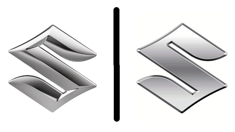
The new emblem keeps the instantly recognizable “S” silhouette that has symbolized Suzuki since 1958, but trades the 3D chrome look for a flat, high-brightness silver finish. The company says the change aligns with its broader effort to modernize its image for the digital age and reduce environmental impact by replacing traditional chrome plating with a more sustainable silver paint.
“The new emblem embodies Suzuki’s long-held commitment to create valuable products by focusing on the customer, as well as our determination to take on new challenges for the future,” says Toshihiro Suzuki, president and CEO. “Under the corporate slogan ‘By Your Side,’ we will continue to walk alongside our customers by providing mobility that’s closely connected to people’s lives, contributing to a sustainable future.”
The refreshed design reflects a broader industry trend, where brands are adapting to a world where logos must appear equally sharp on smartphone screens as they do on motorcycle tanks or ATV grilles. Suzuki joins other global manufacturers such as BMW, Nissan, and Mazda, which have recently flattened and simplified their marks for digital clarity and easier application across platforms.
While the new emblem will first appear on concept vehicles, Suzuki plans a phased rollout across its global lineup, ensuring the new look reaches both its powersports and automotive products in the coming years.
For U.S. powersports dealers, the move signals a broader identity shift for Suzuki — one that underscores the company’s renewed emphasis on sustainability, modernization, and long-term alignment between its motorcycle and off-road businesses and the rest of the global Suzuki brand. We think this one might pass the internet troll test.


Wow what a mistake! Talk about flat and boring! Nevermind it would be a waste of time. Definitely love the old one much better.
Agreed plain and boring look to the new S. No class looks cheap. I’ve owned 6 Suzukis but the recent DRZ update makes me wonder who they are listening to. No 6th gear but they added weight cost and complexity.